![]()
The design of any product, whether physical or digital, is the first thing that attracts the user's attention. If, in addition to being beautiful, it is functional, much better, because the user experience and satisfaction improve remarkably. Therefore, this redesign of Microsoft is late but strong with a view to what the company will offer in the immediate future.
Microsoft and its best work on design issues
The design of Microsoft products and especially its software has never been the highlight. At least, that's how it has been until Satya Nadella came to the company and they began to put more focus on everything related to style guides and the importance that this has in the final product.
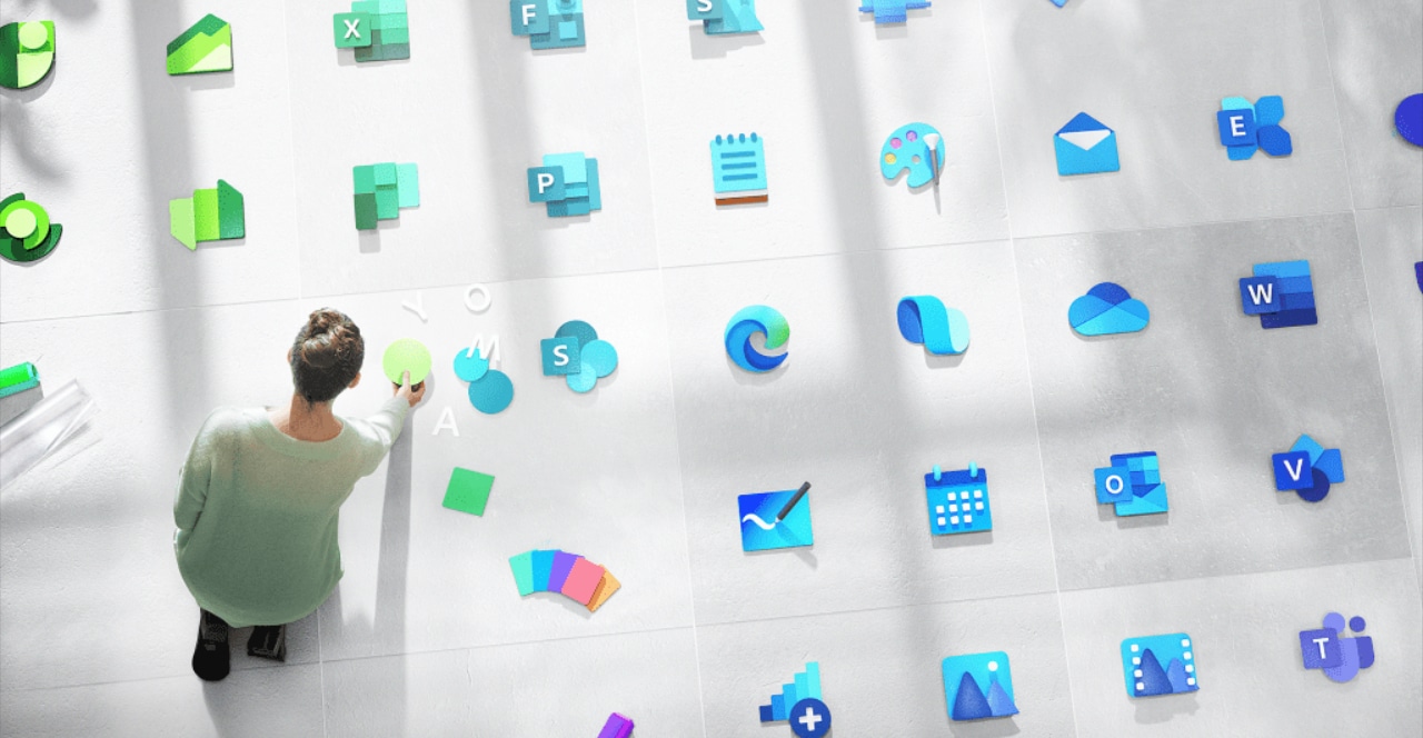
A matter of a year ago, a first job was carried out that affected the Office 365 application icons. Although he was not the only one, some of his most iconic applications were beginning to show a striking and attractive visual experience, they were the first steps of Fluent Design.
Even so, in terms of software, it had to be admitted that Apple's operating systems and many of the applications available in its stores were at a higher level. More consistent interfaces than despite the occasional flaw, because nothing is perfect, offered that plus that ordinary users didn't appreciate as much but that was a great added value for design lovers.
However, Microsoft all this is changing. Apple continues at a very good level, as do many of those who develop for their platforms, but the Redmond company is putting its batteries together in a spectacular way.
If the operating systems had not really stood out and the improvements of Windows 10 with some new icons were marred by the recycling of icons seen in previous versions, all that is now going to change. Along with the improvements in the experience of its mobile applications, something that you can see in the following video, more completely redesigned icons will arrive.
As Jon Friedman, the company's vice president of design and research, comments, embracing the new principles of Fluent Design it will give a major boost to the entire visual identity of many Microsoft products. With over 100 new icons on the way, a much more flexible and updated look will be achieved for the future of new products and launches. But not only that, but also the ability to serve as a recognizable tool for the product. In other words, as soon as the user sees the icons, he will be able to know that it is an application from the company.
If you are interested in learning more about Fluent Design, Microsoft's own website It perfectly explains the bases that will shape everything that is to come. Something that will be more important in the new devices that could mark the next ten years for the company, such as the Microsoft Duo that we already met a couple of months ago.